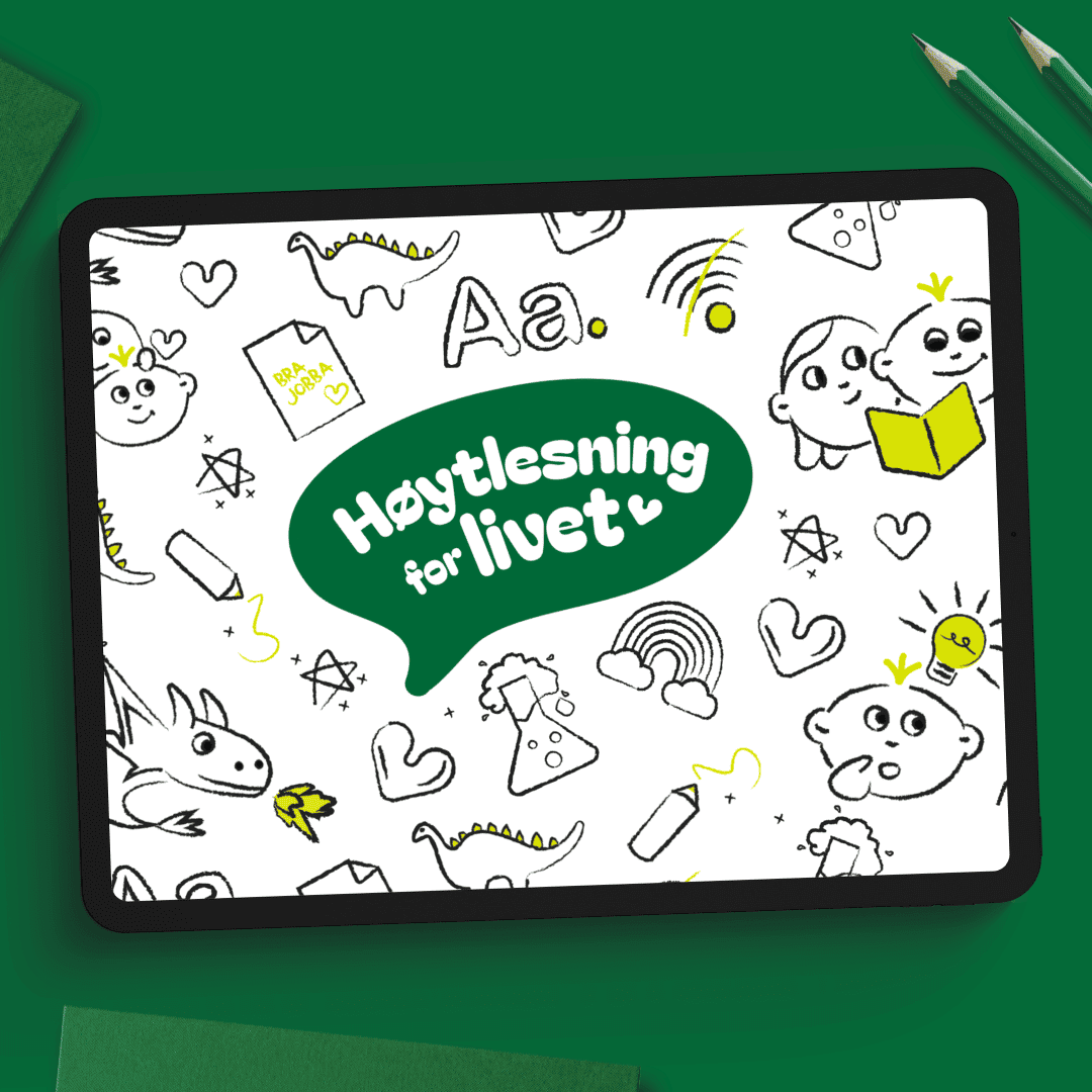
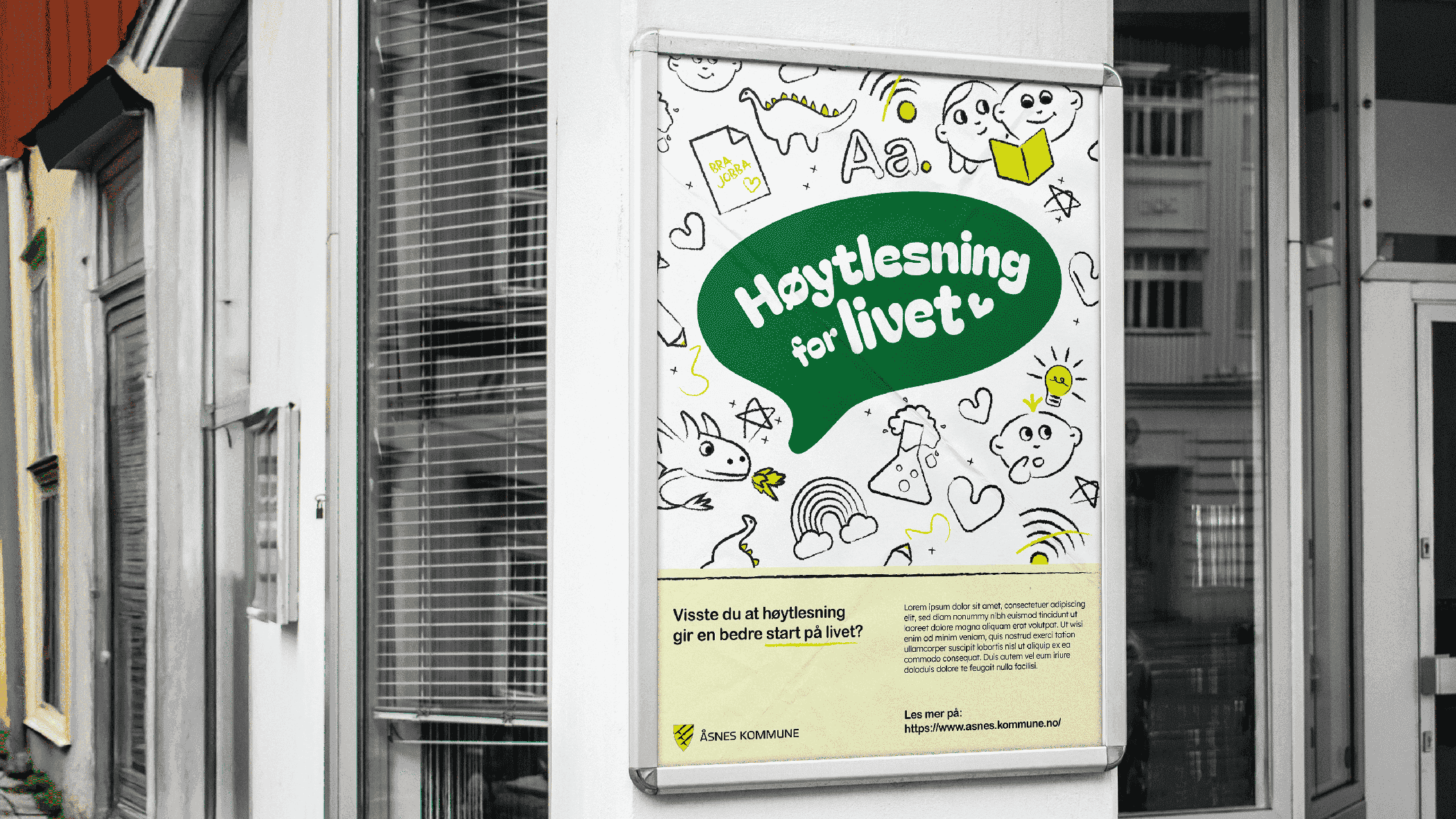
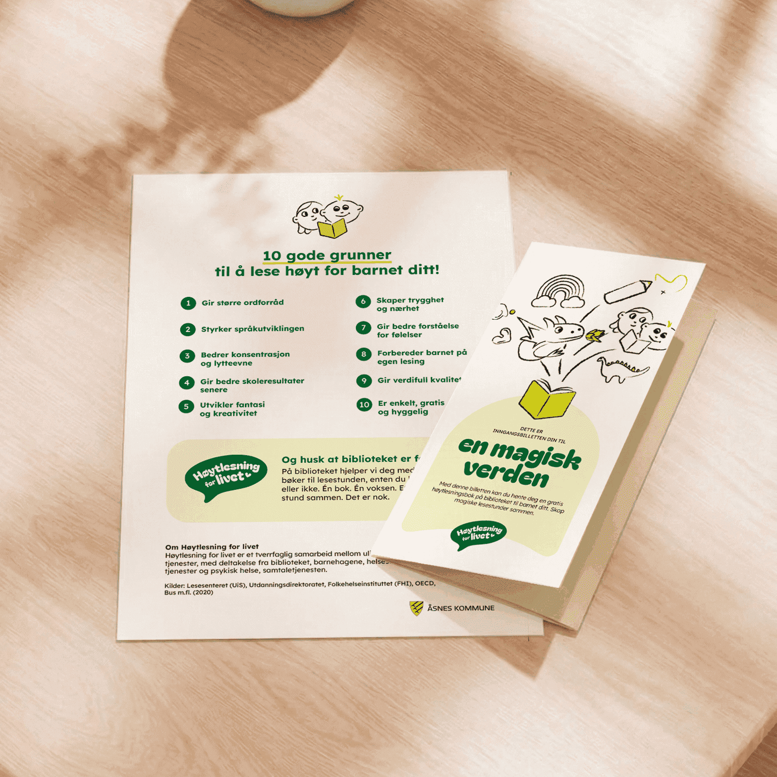
Åsnes Municipality reached out to me to develop a campaign promoting the benefits of reading aloud to children. As a region facing socioeconomic and literacy challenges, our goal was to frame reading as not just a tool for language and academic success, but also a vital bonding activity, offering both parent and child a much-needed break from screens and stress.
Together, we developed a campaign strategy that addressed specific audience pain points, establishing a soft, non-judgmental tone of voice designed for those who find books intimidating. Consequently, the campaign focuses on the nostalgia and the good times found in reading, rather than the books themselves